3 Essential Design Trends, March 2023

One thing that we often think about design trends is that they are probably good to make a list. That’s not always true. Design is a mix of art and subjective thought. You might love or hate these ideas. That is probably very true of this month’s trending elements.

Here’s what’s trending in design this month.
1. Cartoons
Cartoon styles seem to have undergone quite an evolution as of late. The design elements are less in the flat animation style of childhood with a more three-dimension look and feel, fast animation over reality, and even a virtual reality middle ground.
Each of these new cartoon styles has a place in the design landscape and can work for different purposes, although they are not for every project.
The most challenging part of this design element is that cartoon-based elements don’t often play well with other techniques and have to be used almost in isolation. This can create limitations for some designers or projects, part of the reason a trend like this tends to come and go rather quickly.
Three very different ways of using cartoons include:
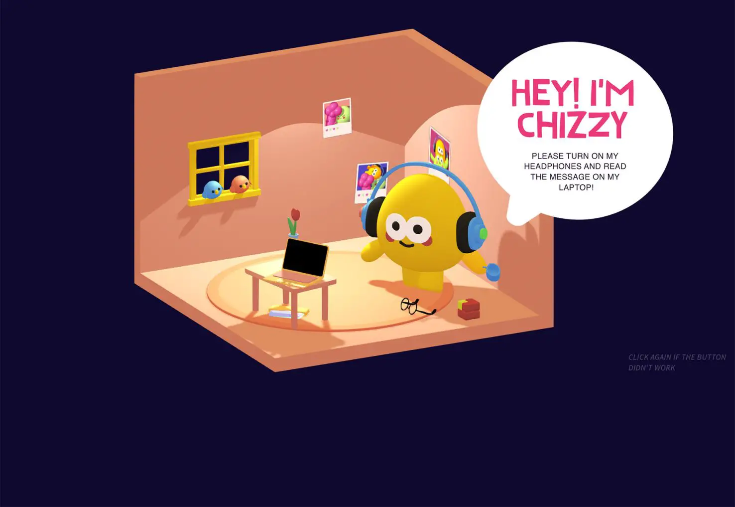
The 3D animated journey of the character from the Chizzy website. This cartoon style has become widely popular in recent years, with even animation and cartoon powerhouse such as Disney using this 3D look.
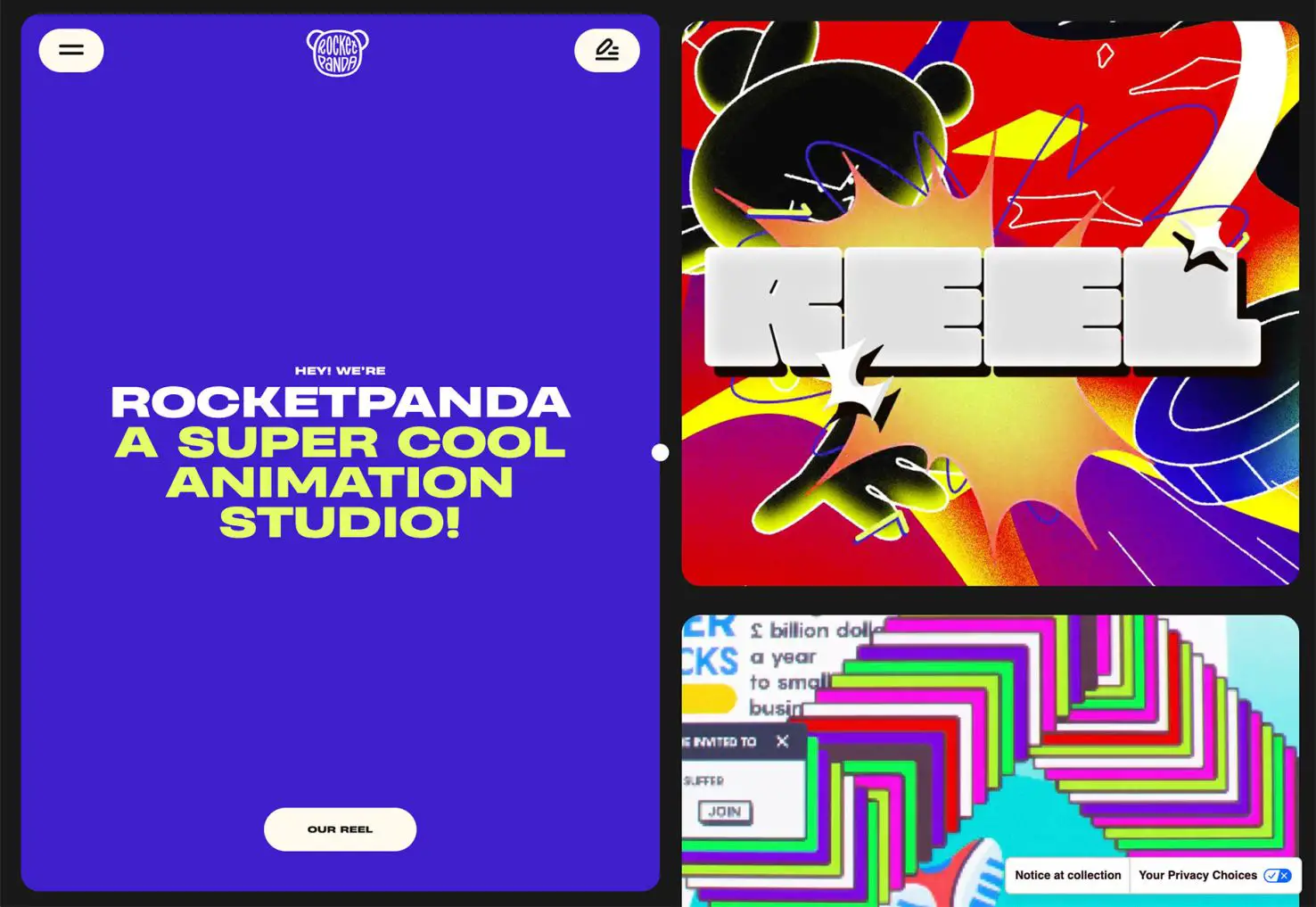
Wild, colorful, motionful cartoons that remind you a little more of childhood but with adult themes or characters such as the cartoons used for the Rocketpanda Animation Studio homepage.
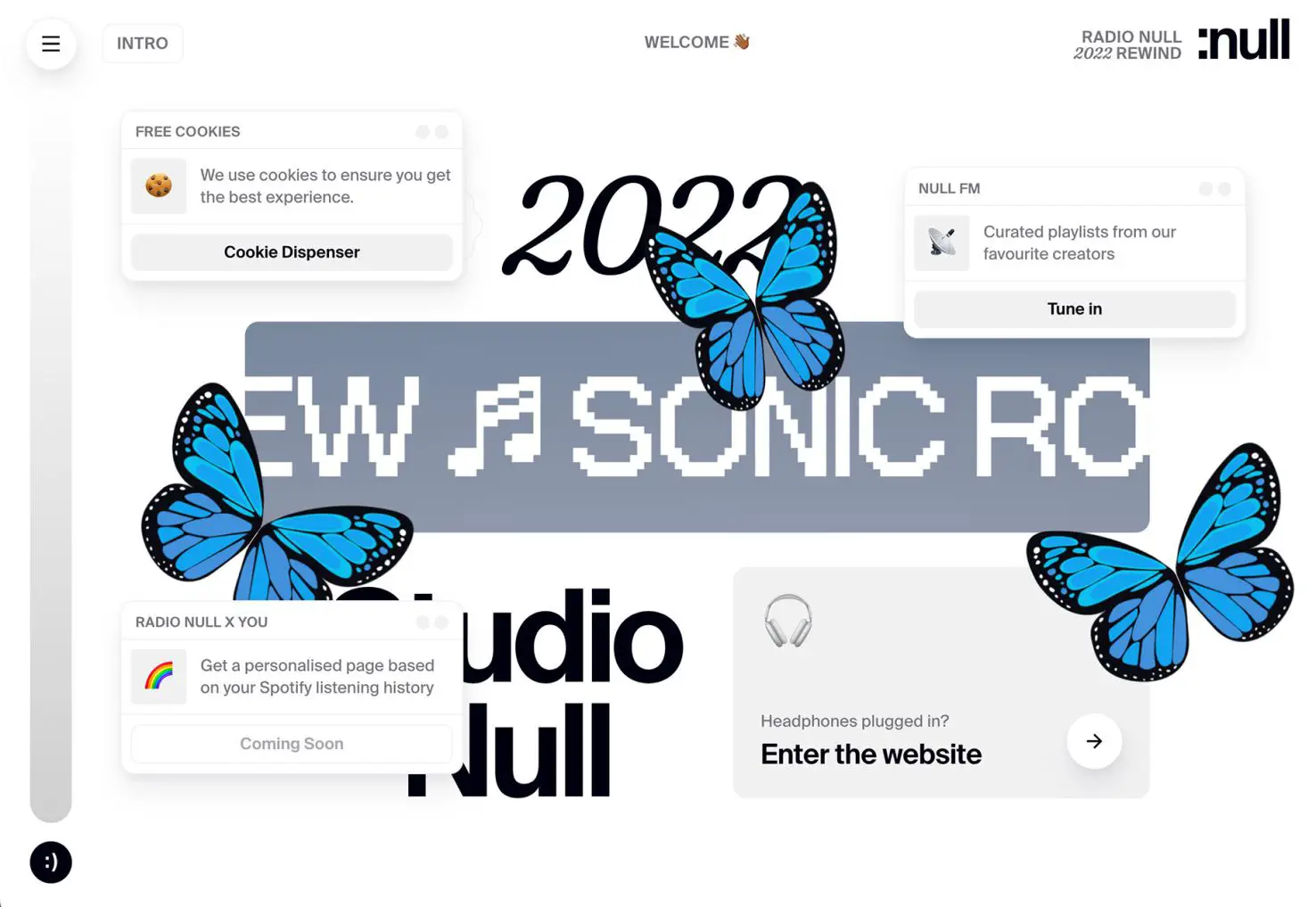
Radio Null has a few beautiful, almost realistic butterflies that are layered with cards and other design elements to add color and visual interest to its homepage.
2. Questionable Typography
This is one of those design trends that you are going to love or hate – but there is a lot of questionable typography out there.
Questionable tends to lead to two questions when you see it:
- Why did they use that typeface?
- What does that say?
The fun thing about this trend is that designers are trying plenty of new things. We are seeing opportunities to use text in ways that weren’t always possible online in the past, which is great. But we are also seeing some risk-taking and chances with typography that don’t always work so well.
The line between cool and artistic type elements and readability is a fine one. You can decide where you fall on using it for your work.
Three quite different examples of questionable typography include:
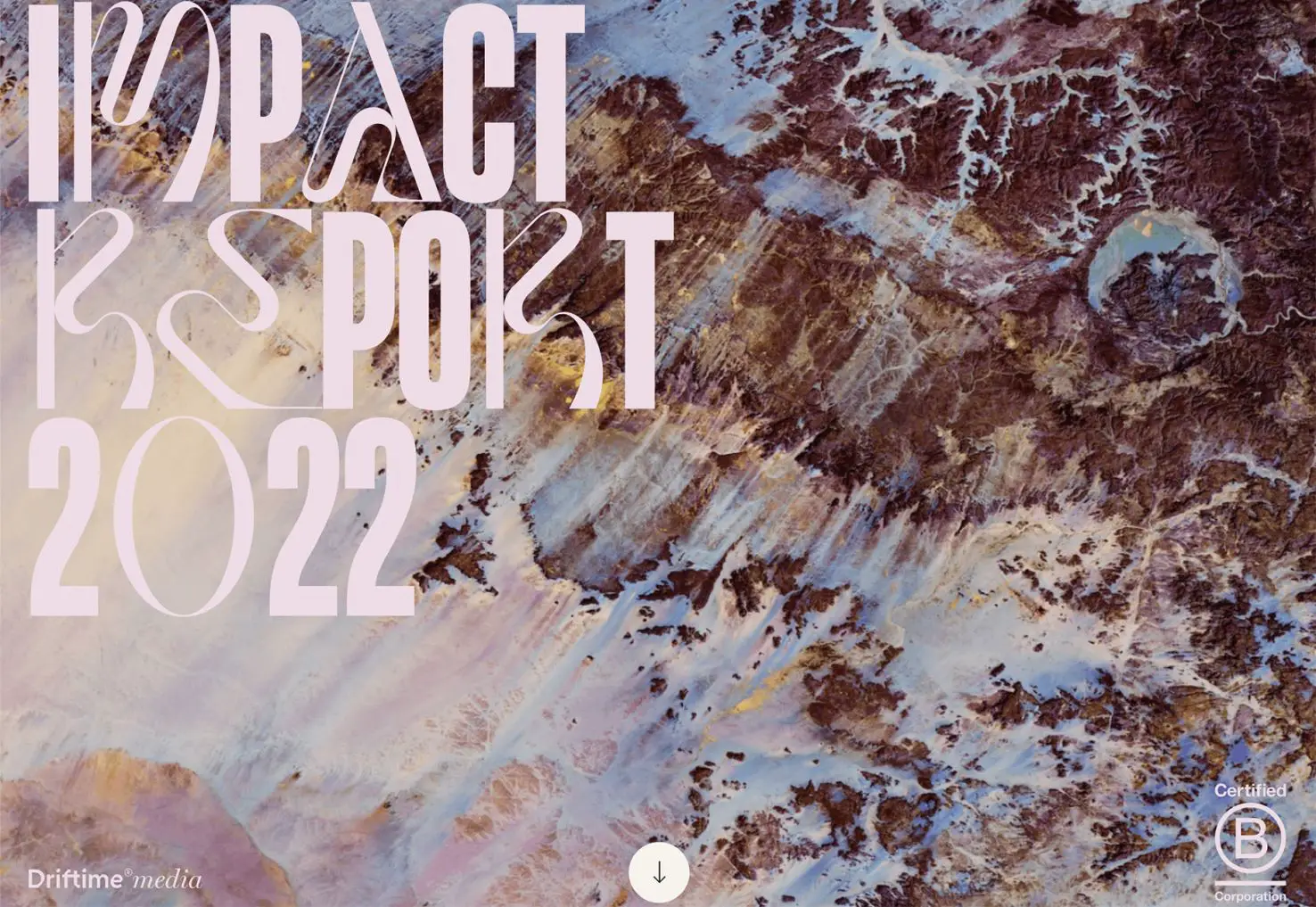
Driftime’s Impact Report uses a mash-up of letterforms with an experimental typeface over a background with a hint of motion. You can’t read it quickly, but you can read it. The letters speak to creativity and enterprise.
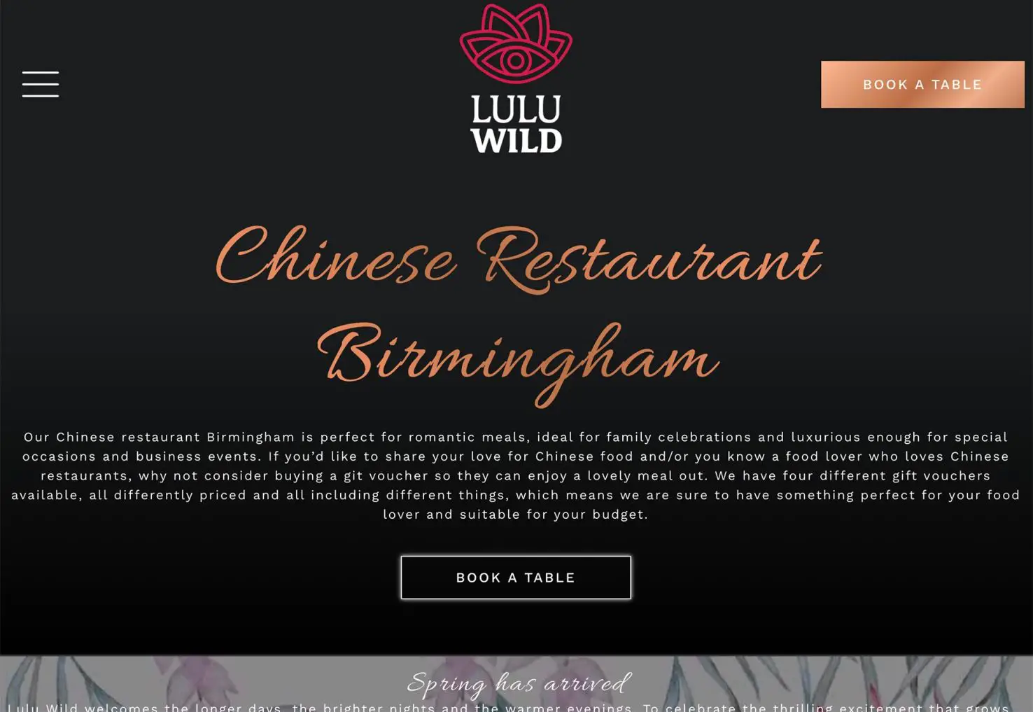
Lulu Wild uses a script typeface that doesn’t quite connect like you want for the main headline and a long block of body copy with almost exaggerated letterspacing. While it might work for the audience, there are some readability concerns here even though the typefaces aren’t uncommon, making it a bit questionable.
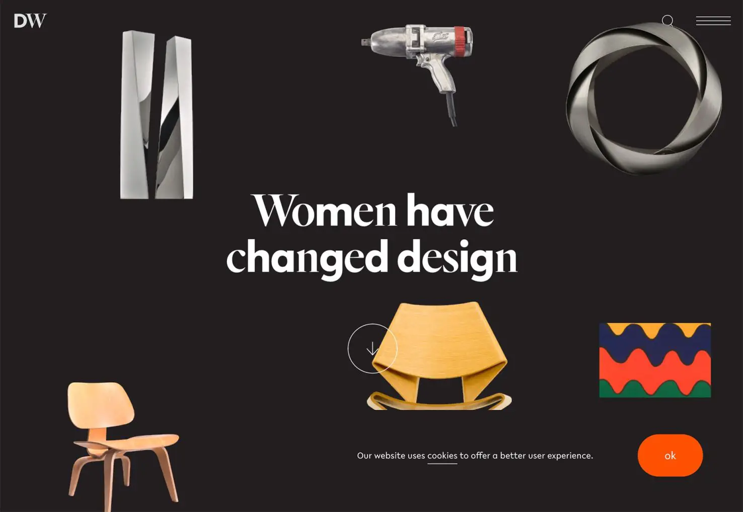
Designed by Women uses multiple fonts within a single headline. This is a choice most designers would not make and creates some difficulty in execution as well. The weights and widths of the typefaces are different, but a common x‑height pulls it together – almost.
3. Vertical Photos or Videos on Desktop
Common practices from mobile users are making their way to desktop design as well. Vertical photo and video is the norm on phones, but horizontal is the dominant ratio on desktop screens.
Designers are creating alternative design patterns to incorporate one size of photo or video into projects for a more universal look and feel across devices. This can benefit responsive design, but might create some usability challenges for desktop users with less usual patterns.
The most common and easy way to use vertical imagery for desktop screens is a split-screen aesthetic. This isn’t a new design trend; rather it is being deployed in a new way. Commonly screens are divided in half, but not always. Text is placed on one half, with images or videos on the other half.
The challenge is over with elements that stretch the width of the design – such as menus or navigation – and how to ensure they work across the divided screen. (You can see each of the sites below did something a little different with navigation elements, with one white boxed as a layer over both sides of the design, one with navigation on one side, and the third with a wholly separate container that does not encroach the split part of the screen.)
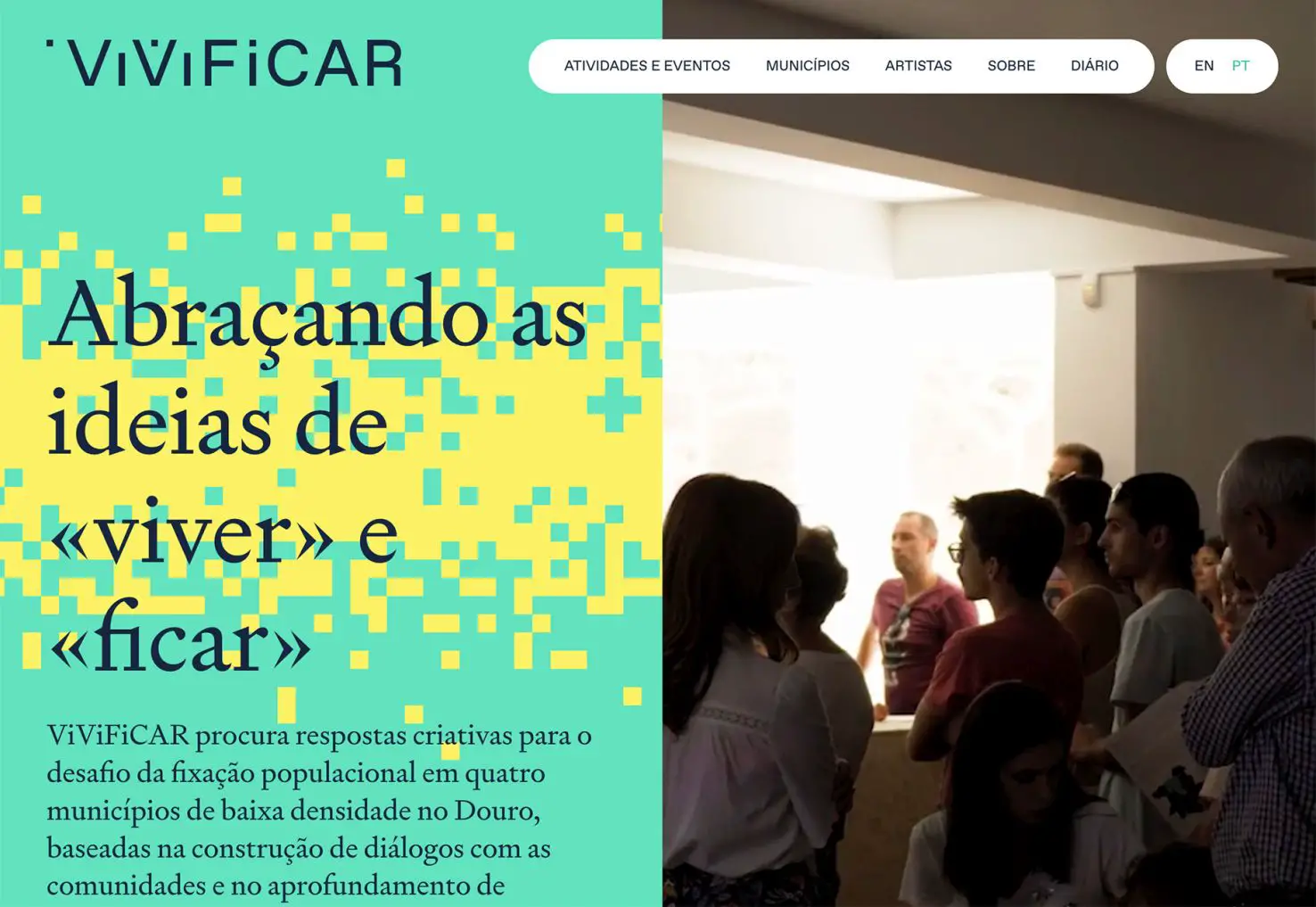
ViViFiCAR has an equal split screen with motion on both sides, but text only to the left of the video.
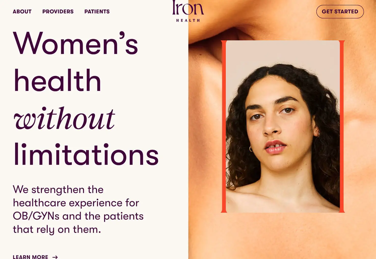
Iron Health does almost the exact same thing as the above example but with still images. The primary image is vertical and layered over a larger background image (also vertical), with all the text placed on the left half of the screen.
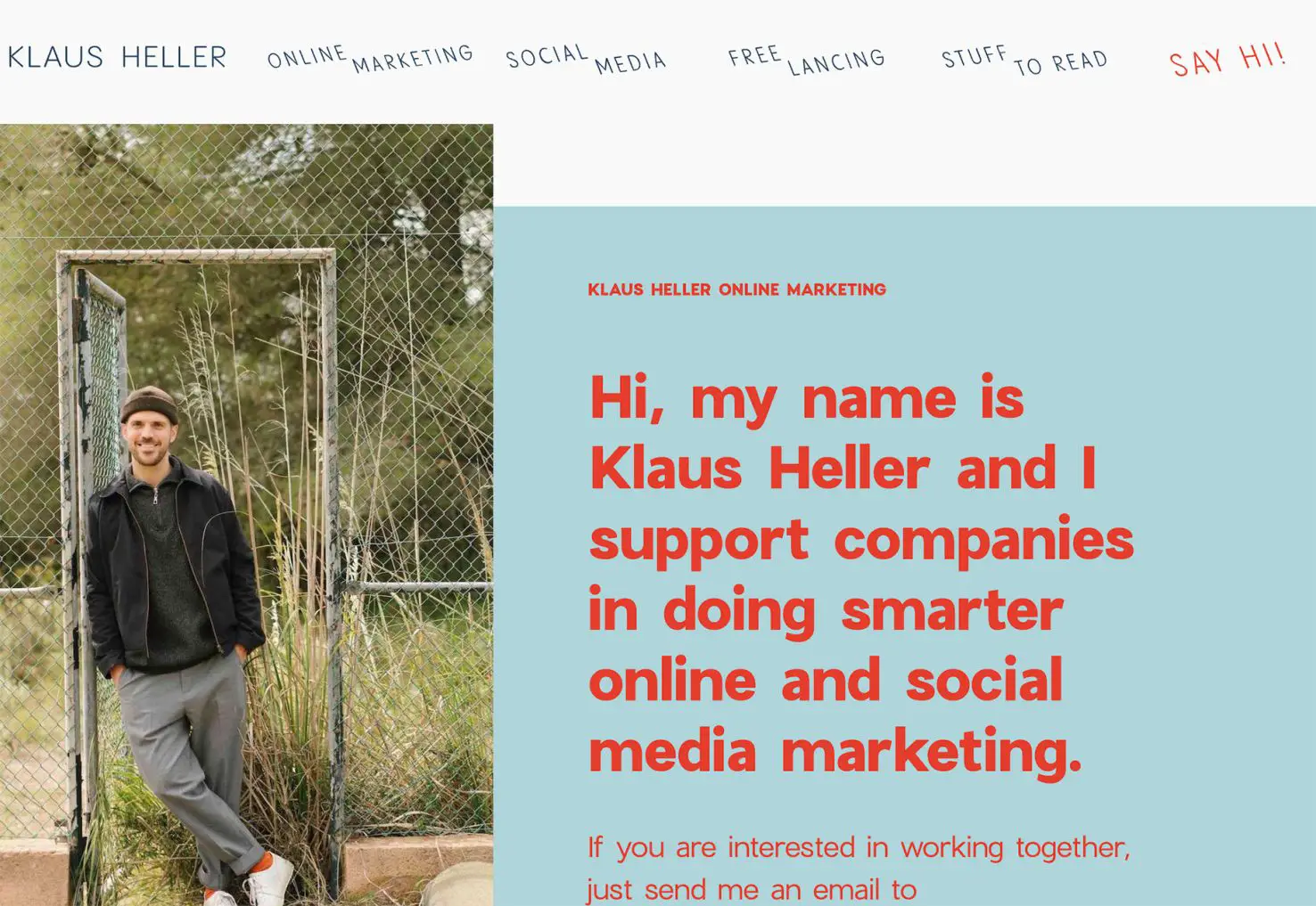
Klaus Heller takes a different approach with a super vertical image on the right without a 50 – 50 split screen. Text takes up more like two-thirds of the screen with a right-of-the-image placement. While this look is great for readability, you’ll have to consciously think about how you want elements to stack responsively. (The default left to right might not be ideal here.)
Conclusion
How do you feel about these design trends? Would you experiment with some of these riskier concepts on the path to a modern website design?
While not every trend may be for you, consider playing with small elements of them to see how they work. You can use a trend for a small section of a design or single element, and you don’t always have to go all-in to try something new and trendy.
Carrie Cousins


Read Next

AI Changes Everything and Nothing

15 Best New Fonts, March 2023

20 Best New Websites, March 2023

Exciting New Tools for Designers, March 2023

Free Download: Budget Planner UI Kit

3 Essential Design Trends, February 2023
Free Download: Education Icons

15 Best New Fonts, February 2023

Unlocking the Power of Design to Help Users Make Smart Decisions

20 Best New Websites, February 2023

AI’s Impact on the Web Is Growing
