3 Essential Design Trends, February 2023

There’s a common theme in this month’s collection of website design trends – typography. All three of these trends showcase popular type elements that seem to be exploding in popularity.

Here’s what’s trending in design this month.
1. Focus on Typography
Admittedly this trend seems a little vague, but we think you’ll know it when you see it. Plenty of projects are being designed with an emphasis on typography.
This includes big, bold lettering, interesting typefaces, big variances in size or color, tiny type animations, and an overall stripping of strong imagery from the screen. You won’t see many photos or videos here (and if you do, they are probably small).
After that, almost anything is allowed. And the designs are quite stunning!
These projects include all kinds of typography, from experimental to bold. (You can even find it in the new typography animation in the new design for this website in the homepage banner.)
Here are three examples of three very different directions on this website design trend:
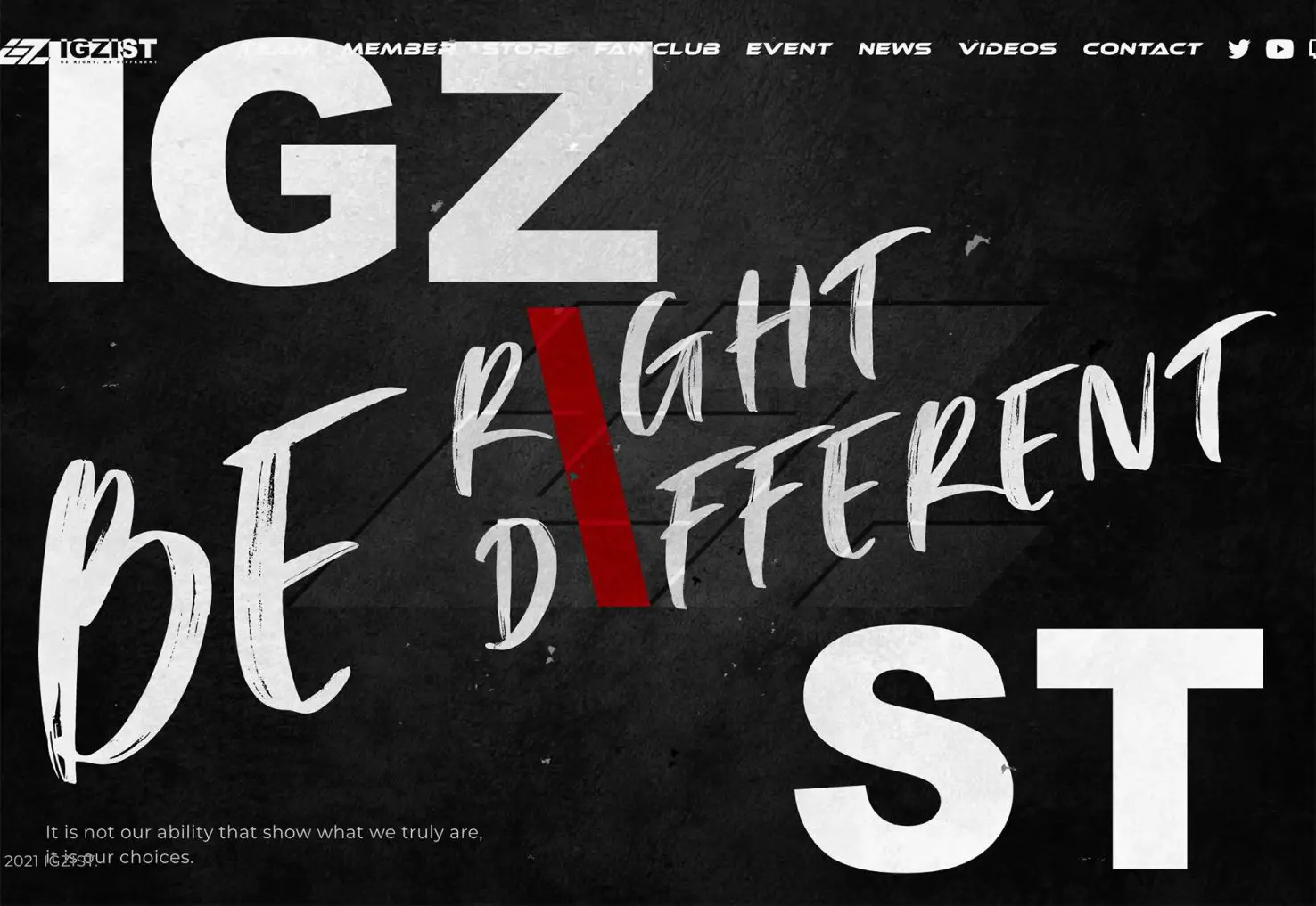
IGZIST combines an oversized slab serif with a handwriting style that takes the whole screen. With a black-and-white aesthetic and red accent, everything has an in-your-face feel. There’s a glitch animation that also layers on top of everything to keep it interesting.
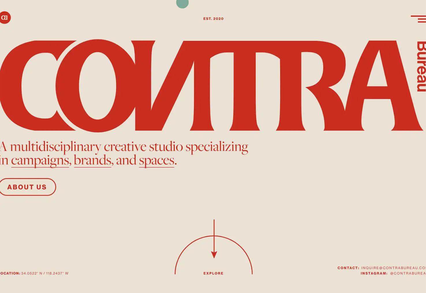
Contra Bureau combines a too-close-for-comfort headline in “CONTRA” with sideways text, a sub-headline with underlines, and multiple typefaces in a bold red and beige color scheme to make you hang on to every word. Immense contrast in style and size contribute to the effectiveness of this typographic gem.
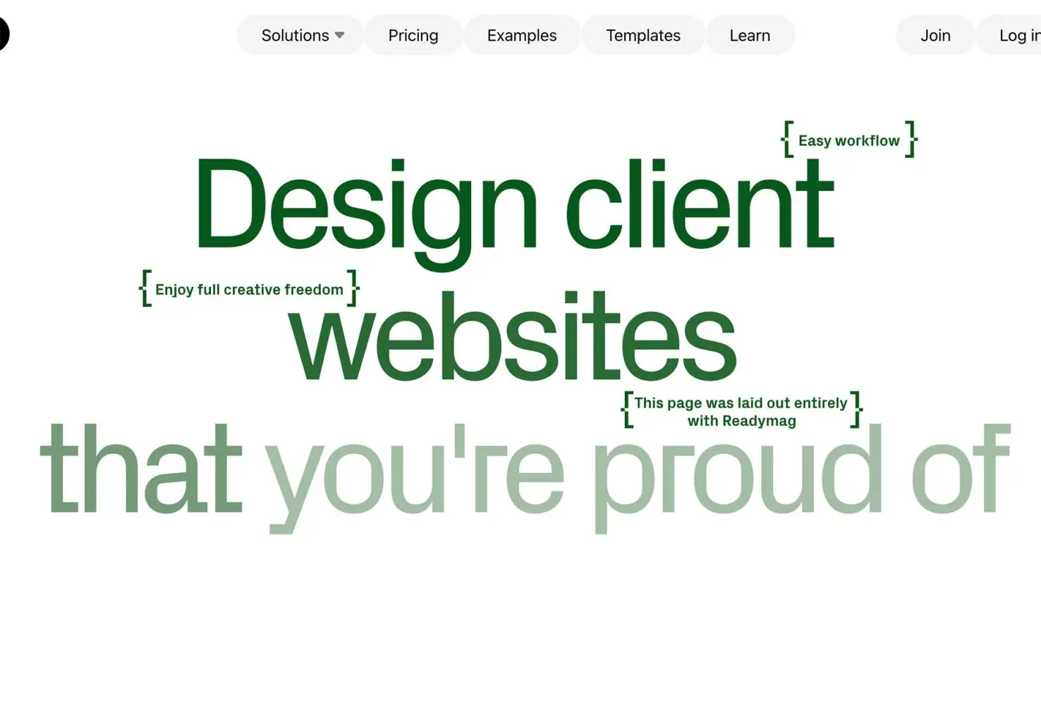
Readymag uses an interesting typeface in a color variable animation to make you ready and get your attention. The green-on-white pattern isn’t common and is a bit of a disruptor in itself. The most graphic elements on the screen are the navigation buttons and the brackets for small text elements.
2. Heroes with Very Little Text
This typography trend actually includes very little text. Many designers are creating hero headers with almost no text at all aside from simple navigation.
How does this work? How does a user engage when there isn’t anything to read?
The images have to be super engaging. And even then, this design style can still be a risk. Look at the examples below; is there enough to make you click or scroll?
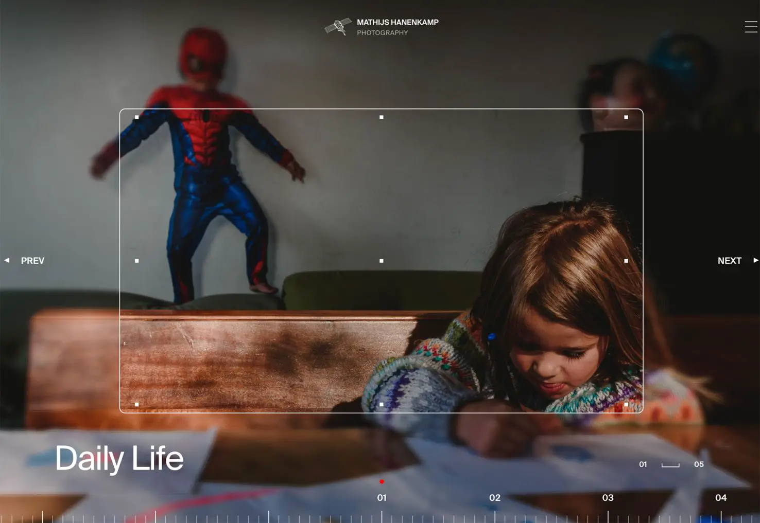
Mathijs Hanenkamp’s portfolio site uses a big photo with a small headline in the bottom left corner. But there’s an interesting top layer with animation that makes you think are little more. Then when you realize it is for a photographer’s portfolio, everything kind of comes together.
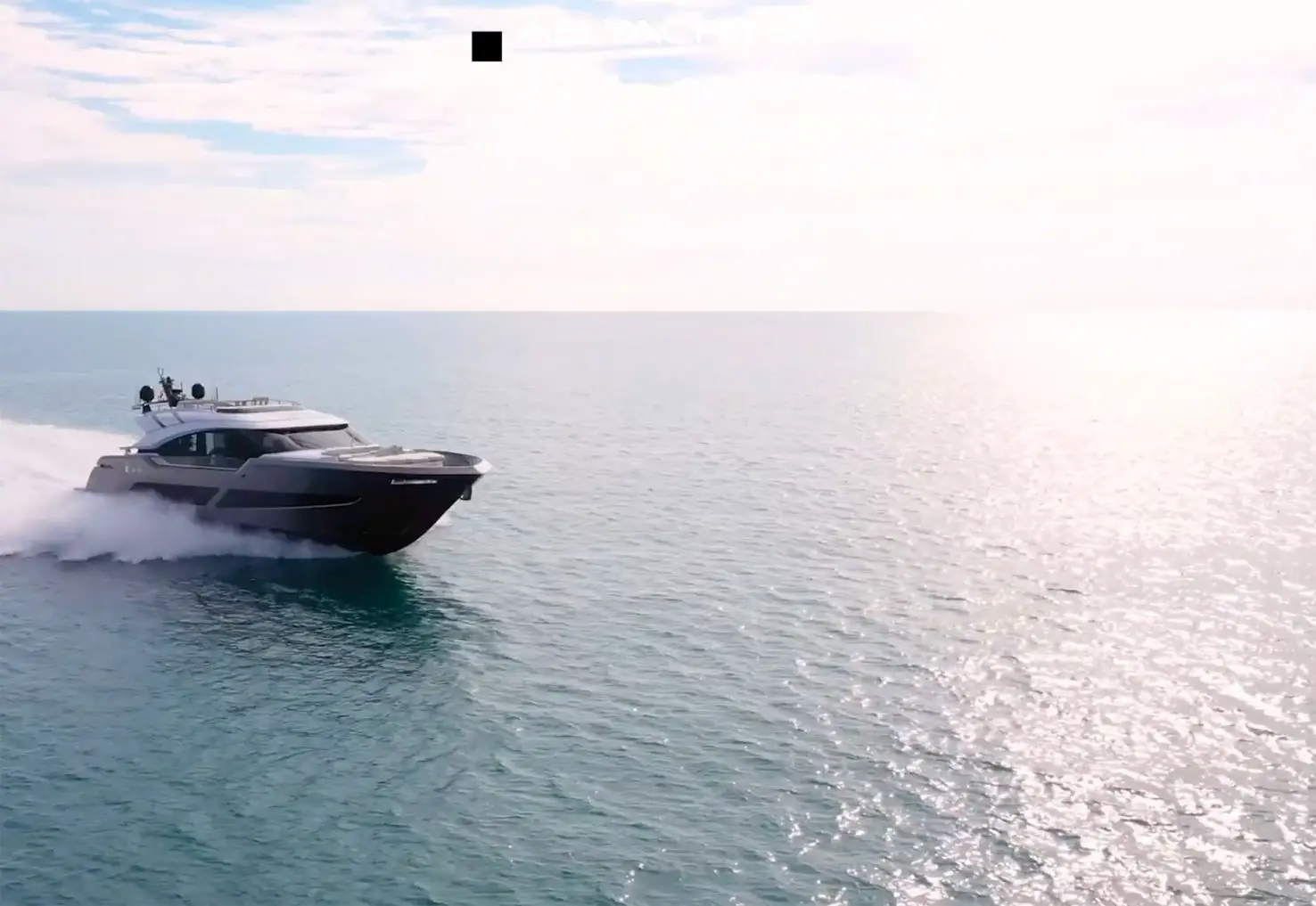
AB Yachts has no text on the home hero besides the name brand. If you know the company, the video is probably enough to keep you going, but if not, it could be more of a stretch for unfamiliar users to continue engaging.
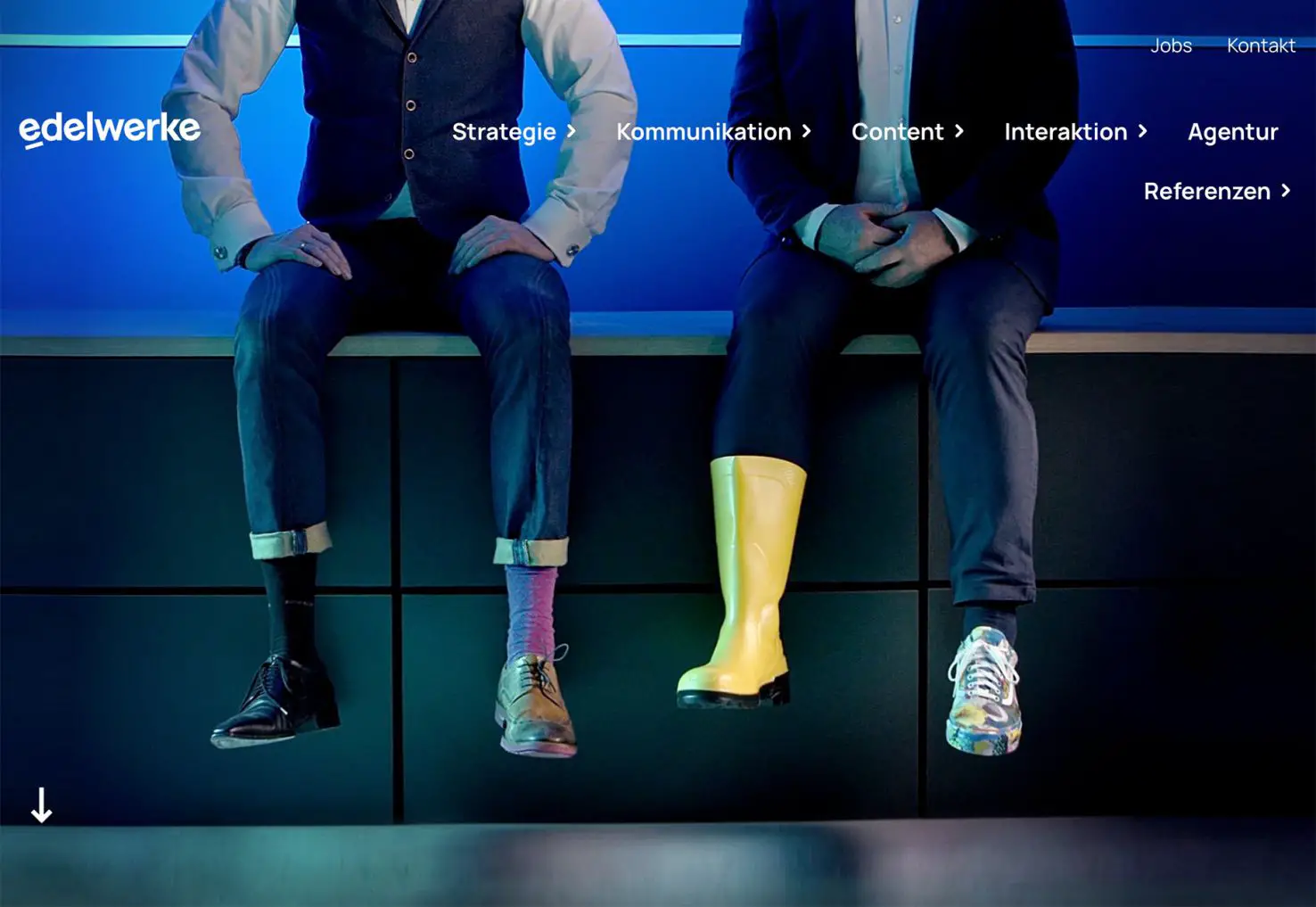
Edlewerke focuses on an unusual image (there’s also a tiny animation here) and navigation to help you move through the site. It’s visually striking, but is it enough? Tracking analytics on a design like this would definitely hold the answer to that question.
3. Serifs Everywhere
For designers that came up in the world of print, this website design trend can be a breath of fresh air – serifs everywhere!
While serifs have become much more common with websites, they still don’t come close to the usage of sans serifs. The right serifs can be beautiful and highly readable.
They can also be used in various ways to create a design with a nice focus on typography that isn’t the only focus of the design. This trend is more of a middle ground between the two more extreme examples above.
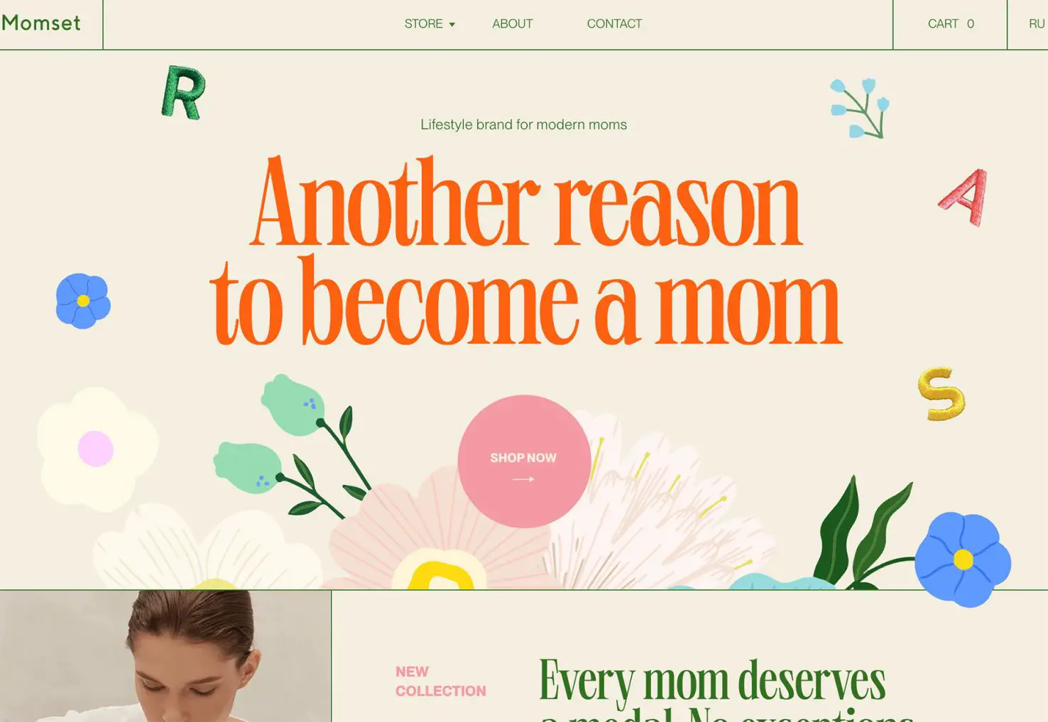
Momset uses a somewhat larger condensed modern serif for the primary headline in the hero area as well as other headers throughout the design. Color adds an extra element of interest here, and the use of space keeps this typeface readable.
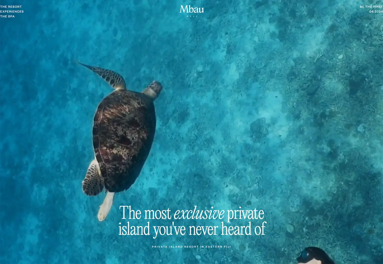
Mbau goes super simple with a full-screen video that rolls behind a simple serif headline that never moves. This design feels elegant and classy, perfect for a travel site. Using “exclusive” in italics almost jumps off the screen because the design pulsates with that feeling.
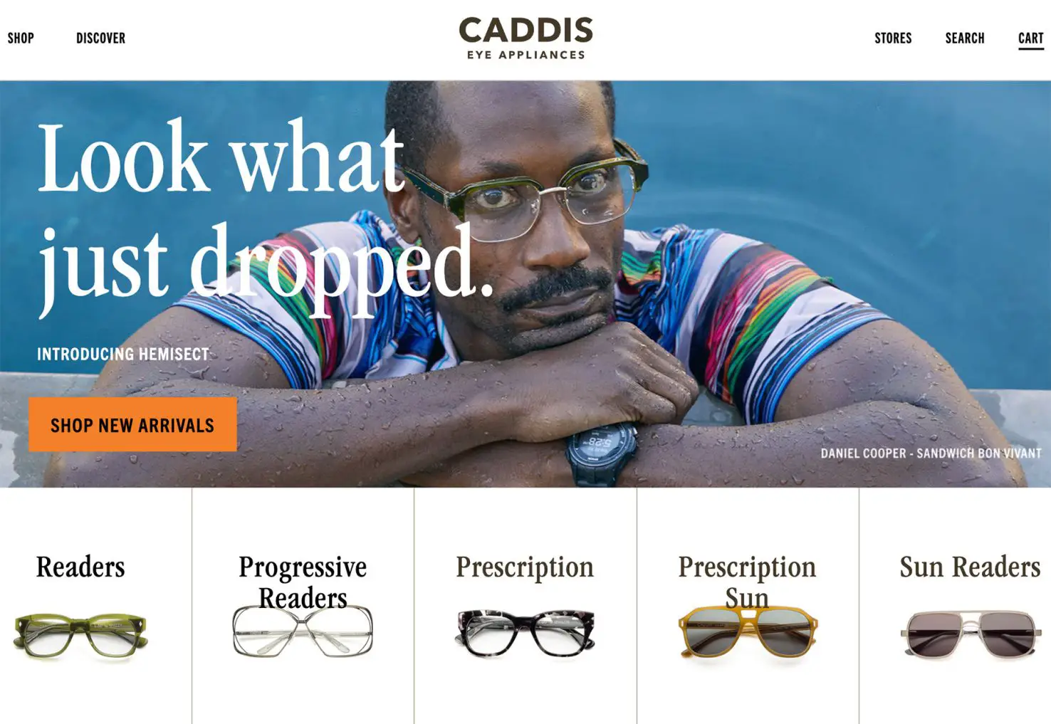
Caddis Eye Appliances uses a large serif headline and subheaders balanced by smaller sans serif elements for other text elements. What’s fun about his entire design is that it is about being different – they use the term “nonconformists” – and the serif helps exemplify that mantra visually.
Conclusion
Typography trends are an exciting design element because, depending on your brand – and style guide – you may or may not be able to take advantage of these elements. How do you balance incorporating a trend and maintaining brand identity?
There’s not always an obvious answer, but many brands do find a way to create just the right elements to keep themselves looking fresh without losing who they are. Look at your brand rules to decide what constraints you have to work within and how you can bend to be both on-brand and on-trend.
Carrie Cousins


Read Next

AI Changes Everything and Nothing

15 Best New Fonts, March 2023

20 Best New Websites, March 2023

Exciting New Tools for Designers, March 2023

Free Download: Budget Planner UI Kit
Free Download: Education Icons

15 Best New Fonts, February 2023

Unlocking the Power of Design to Help Users Make Smart Decisions

20 Best New Websites, February 2023

AI’s Impact on the Web Is Growing

Exciting New Tools for Designers, February 2023
