3 Essential Design Trends, January 2023

Minimal styles with big, bold text is the biggest trending website design element of 2023 so far. There are many projects out there that are text-heavy without a lot of other embellishments or imagery. You’ll see a lot of that here, with a few other goodies mixed in.

Here’s what’s trending in design this month.
1. White On Black
Black and white styles are a timeless classic. Designers use this simple color(less) duo because it is simple, elegant, and works with practically any content. What we are seeing right now is a move to create design aesthetics that feature bold white sans serif typography on stark black backgrounds.
The result is a design that you have to read. The words are often so in-your-face and concise that you can help but get the message the design is trying to convey.
Each of these examples takes a similar but varied approach to this design trend.
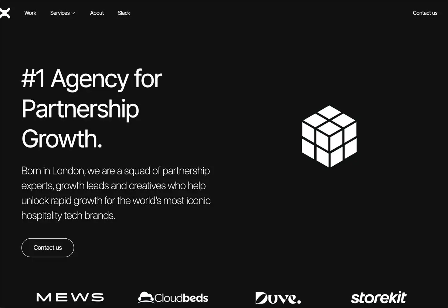
Bond Agency has more words than the other options, with a little more description of who and what they are. There is an animated accent as well to help keep you on the design long enough to read the words and generate interest.
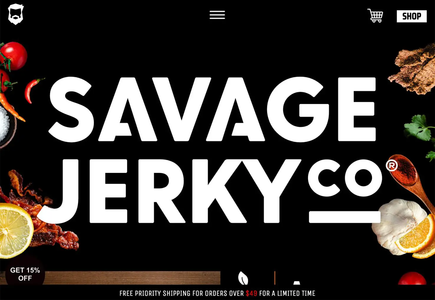
Savage Jerky goes big and bold with its brand name and very little else. The shop button is featured in a white highlight. This design is made to get your interest and facilitate a purchase, especially for those that already know the brand.
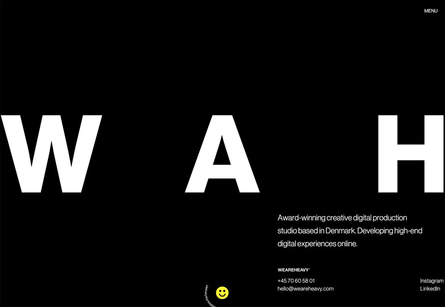
We Are Heavy goes super simple with three big letters and some smaller accent type. It’s so stark that it probably piques your interest. Then there’s the fun little smiley face at the bottom, begging you to click and learn more. It jumps off the screen because it is the only color besides the matching mouse pointer.
2. Orange Accents
Orange isn’t a color we often talk about in design. The associations with the hue can be somewhat fragmenting, but as these examples show, it can make a great accent color.
As an option that’s a little less harsh than red – a common accent color – orange feels a little less intimidating.
There are a lot of variations, from a traditional orange to something more peachy to a rust hue. The great thing is that, for the most part, oranges will stand in contrast on light or dark-colored backgrounds and can be an excellent container for text elements.
Because this color isn’t as commonly used, it is also an immediate attention grabber.
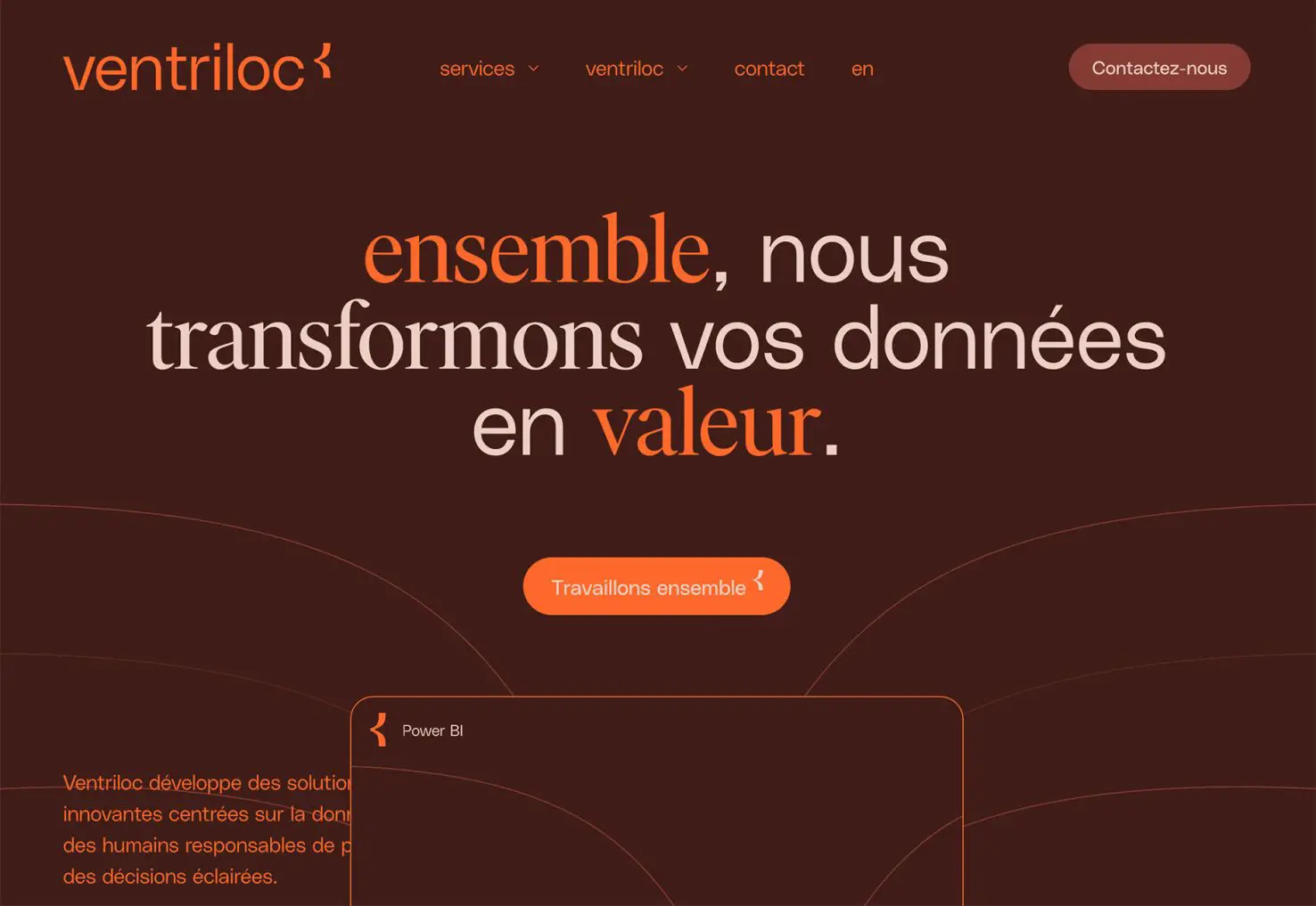
Ventriloc uses orange against a brownish-maroon background to bring focus and attention to keywords on the screen, buttons, and navigational elements. Below the scroll, orange continues as the primary accent color, even when the primary hues shift, helping to carry the visual theme.
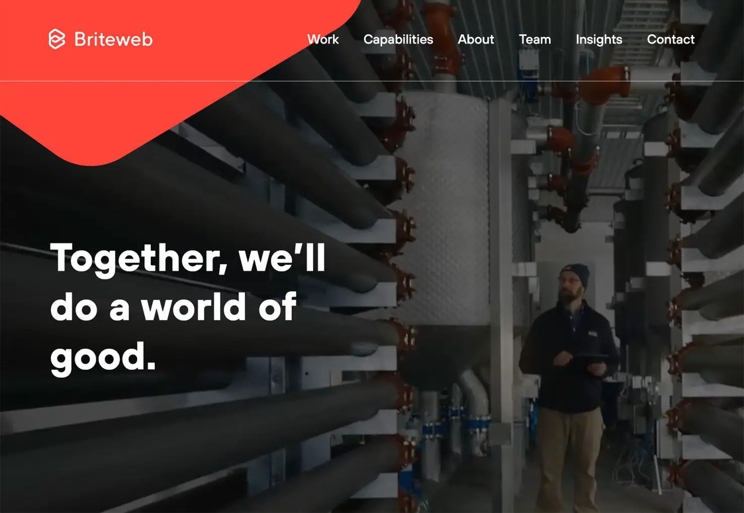
Briteweb uses a simple orange geometric shape to highlight branding and add an element of interest to a page that would otherwise be mostly a video reel. The shape helps draw the eye from the branding/logo to the headline on the homepage header. The color is continued below the scroll for clickable elements.
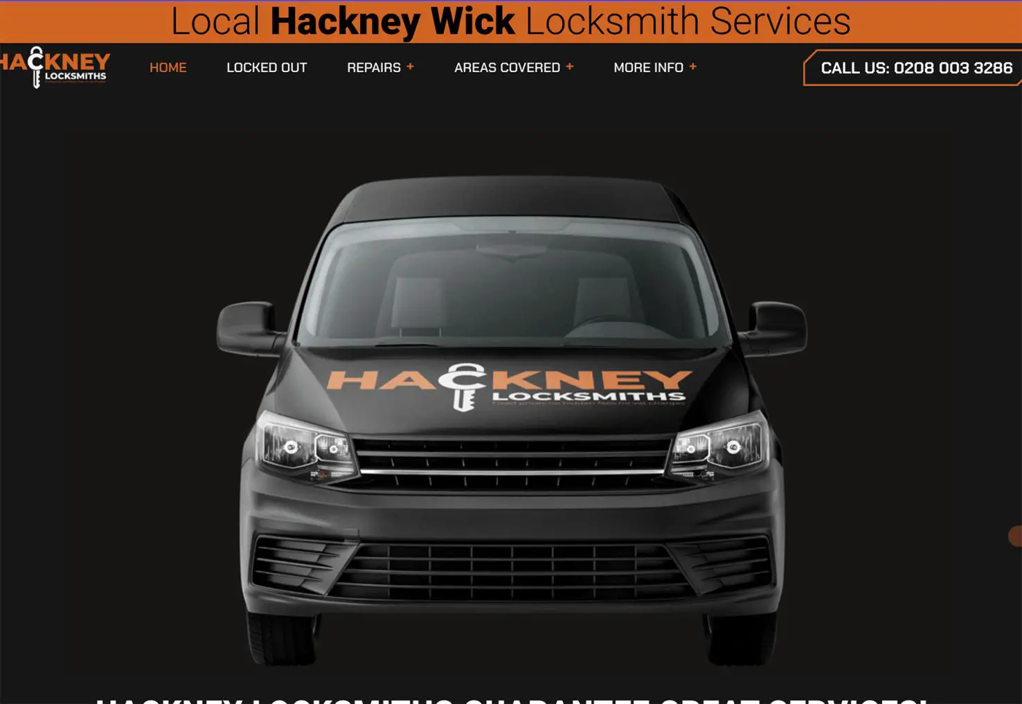
Hackney Locksmiths uses orange as a primary brand color but more of an accent for the website design. This approach has a classic feel and easy-to-read effect. The orange banner at the top of the screen also ties to company to the logo if you don’t know them or see their distinct color choice in a real-life environment.
3. Text-Only Homepages
This trend builds a lot and is reminiscent of the first collection of examples in this post. Text-only homepages are everywhere. What’s different here is that there’s no color requirement and the typography styles are kind of all over the place.
These designs are created in a distinct effort to be read. You are supposed to think about the words and how the message pertains to you. And if it isn’t relevant, there’s little chance you will scroll or further engage with the design.
That makes this a risky choice, but one that can pay off with the right audiences.
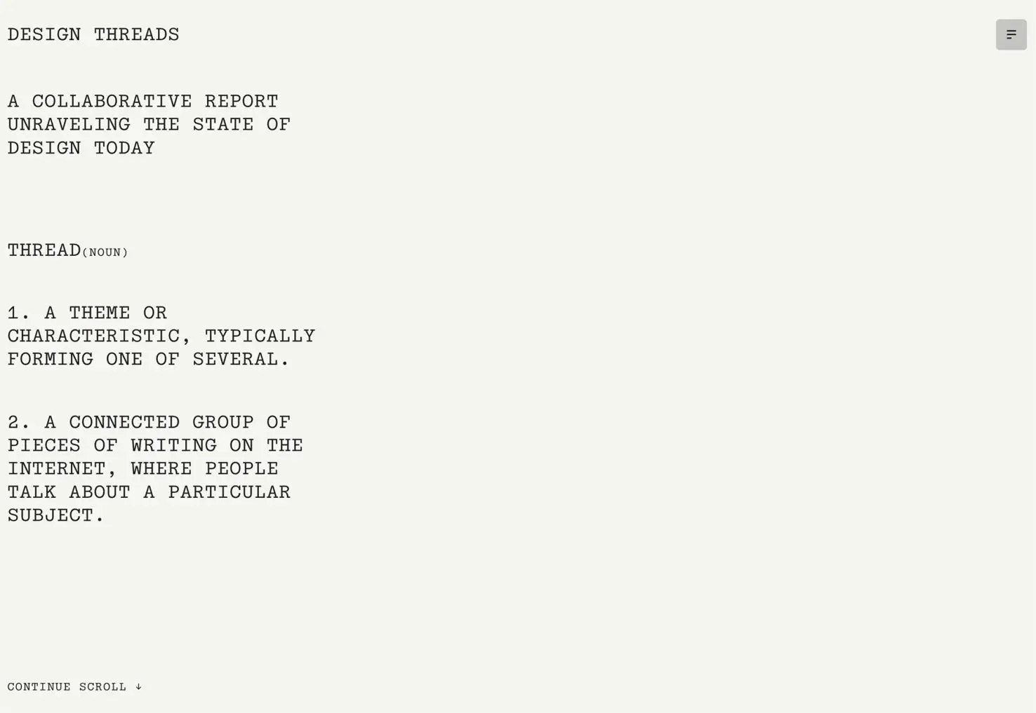
The Design Threads report homepage provides a simple introduction to the report and what it is. Notice that even the call to action – “continue scroll” – is text-based. The complete design is very text heavy, although there are a few pops of color and artwork deeper into the report (which is also a relevant read for designers).
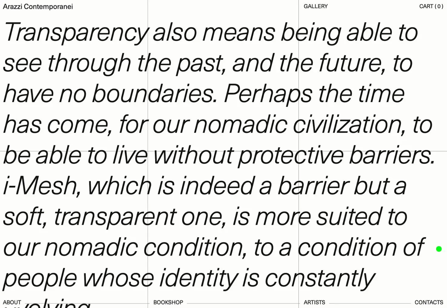
Arazzi Contemporanei uses an almost hard-to-read text design scheme. Words overlay other words – note the down page navigation – and there’s a green highlight that can help or hurt readability (you choose). It’s one of those trend designs that you get stuck in “is this great?” or “do I hate it?”
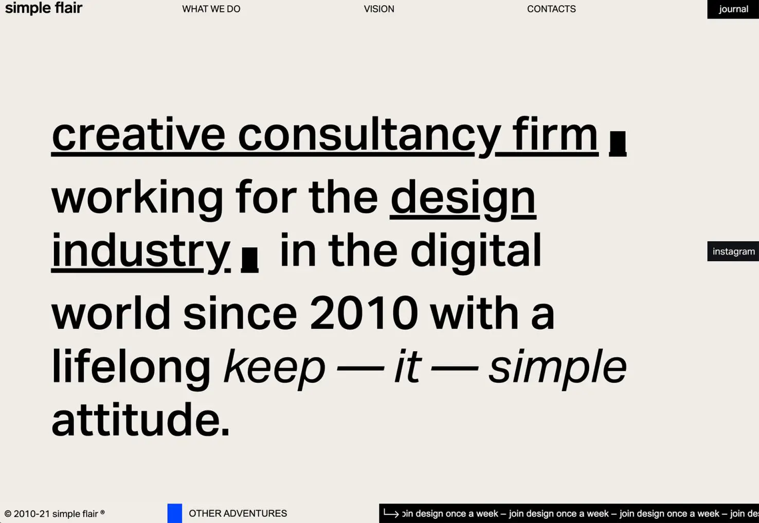
Simple Flair is a bit like the example above but is easier to read. There are no design elements on the homepage other than text with some accenting in underlines and italics. Again, do you love it or hate it? It seems to be a very thin line between the two here.
Conclusion
The one thing all these trends have in common is more of a shift back toward minimalism. That’s an overall design construction that never completely goes away but comes in and out of fashion regularly. These projects lean toward a trend of minimalism making a significant return in 2023.
Carrie Cousins


Read Next

10+ Best Tools & Resources for Web Designers and Agencies (2023 updated)

3 Essential Design Trends, March 2023

AI Changes Everything and Nothing

15 Best New Fonts, March 2023

20 Best New Websites, March 2023

Exciting New Tools for Designers, March 2023

Free Download: Budget Planner UI Kit

3 Essential Design Trends, February 2023
Free Download: Education Icons

15 Best New Fonts, February 2023

Unlocking the Power of Design to Help Users Make Smart Decisions
